Twitter ♥ Ellipsis

I felt like this warranted a blog post, no matter how short.  But hey, it’s about Twitter, so a short post is appropriate!

The ellipsis (Wikipedia) is three periods in a row often used to signify that content has been abbreviated or truncated.  In the world of automated (or automation-assisted) Tweet composition, it’s a common thing.  There’s also a premium on character count in the Twitter world, particularly when it comes to automation.

Well here’s an easy way to squeeze in two more characters:  The ellipsis character.  Rather than trimming an extra three characters (for three periods) from text that is too long, you can trim just one character (for an ellipsis).  Examples:

  • This text is truncated without three periods ...
  • This text is truncated with an ellipsis …

They look the same, but you can tell they’re different by trying to highlight each period separately on the second example.  And, in line with my rampant narcissism, I wrote a 140 character tweet about this very blog post which uses — you guessed it — the ellipsis character.  And finally (because I wanted to use Twitter’s Blackbird Pie tool), here’s a pretty representation of the same tweet:

I’m writing a fun blog post about the benefits of the ellipsis character when truncating text for the purposes of programmatic autotweeting…less than a minute ago via Tweetie for Mac

Twitter ♥ Ellipsis

HTML5 and jQuery

The last time I was unemployed, I put together Fav.Premo.biz.  Unemployed again, I’ve dipped into code all over the various projects I’ve got up and running.

With the exception of the main site (i.e., the page you’re reading), I’ve decided to change all of my sites from HTML4 or XHTML to HTML5.  In addition, I’ve decided that now is a good time to stop using Prototype and script.aculo.us and start using jQuery.

I’ve decided to move to HTML5 for two main reasons.  First, HTML5 is more elegant than HTML 4.x or XHTML 1.x.  I love elegance when it comes to programming.  I find that the criteria which determines what is and is not valid HTML5 code is less draconian than for HTML4.x and XHTML1.x.  Also, HTML5 introduces new features that allow developers to add greater functionality with hand-written markup.  Greater flexibility and greater functionality sound pretty elegant to me.  Second, due to these new features, HTML5 provides for greater use of open source technologies.  The long and short of my feelings in this area is that HTML5 gets us one step close to a world without Adobe Flash.  The <audio> and <video> tags allow developers to add rich content to sites without relying on a closed source, proprietary plugin that is a resource hog and a security risk.  Who couldn’t love code that’s more elegant combined with a better user experience?

I’ve decided to move to jQuery because jQuery is updated far more frequently than the JavaScript frameworks I’ve been using up until now — Prototype and script.aculo.us.  For example, jQuery 1.4 was released in January 2010 and jQuery 1.3 was released in January 2009.  When it comes to Prototype’s progression over that time, I can only estimate that it’s seen two bug releases (0.0.0.x) and one maintenance release (0.0.x).  Although putting out regular updates to a code base may be virtuous, it’s not the whole story.  Every time jQuery is updated, its release notes contain graphs showing speed improvements for all major browsers.  Speed improvements on an annual basis.  This just isn’t happening in Prototype or script.aculo.us.

I have a few public-facing sites that use JavaScript here and there, but only one makes heavy use of it: Fav.Premo.biz.  Since modifying code to use both HTML5 and jQuery would be painful at best, I’m going to rewrite Fav.Premo.biz using these new technologies.  It’ll be an undertaking, and it might not be finished soon, but it should be interesting.

HTML5 and jQuery

Windows Money Savers

Today I checked out Ars Technica’s latest Week in Microsoft, and came across two articles that might save Windows users some money.

The first is about Microsoft’s freshly-out-of-beta antivirus suite.  First look: Microsoft Security Essentials impresses.  In 2006, Microsoft released a retail antivirus program called Windows Live OneCare.  By the end of 2008, Microsoft had announced that it would discontinue this product in favor of a free replacement called Microsoft Security Essentials.

For years I’ve been using AVG Free, but today I uninstalled it (you don’t want two antivirus programs running at the same time) and installed MSE.  It looks like it’s a bit easier to use than AVG and I must say, it’s got some beautiful system tray icons.  I might write a post in the future with some expanded impressions of the product, especially with Windows 7 coming out this month.

Microsoft Security Essentials can be downloaded here.

The second article is about something I’ve known about for years but to which I’ve never committed.  Newegg reveals Windows 7 OEM prices.  I’ve known about OEM versions of Microsoft Windows since before Windows Vista was released.  From what I understand, an OEM copy of Windows is only supposed to be used on a newly built machine.  However, I believe that is more of a suggestion in line with the “Student and Teacher” edition of Microsoft Office (which has since been renamed to the “Home and Student” Edition.)  On Newegg’s listing page, the text appears to be cut off, but here’s the part that caught my eye:

software requires the assembler to provide end user support

That made me think:  Hell, I’m capable of that.  I’d prefer it that way, in fact.  If I were married with kids, I’d probably put an OEM copy of Windows on each of their machines, too.  I wouldn’t suggest it for my parents or my sisters, or even my best (nontechnical) friends, though.  But for me, why not?  Oh, and why is this a money saver?  Depending on the edition of Windows purchased, the OEM version is about 50% cheaper.  The greatest savings percentage-wise appears to be on the Professional Edition, which is the one I’ve got my eye on.

Newegg lists every version of Windows 7 it’s selling here.

So if you’re a technical person, take a look at both of these articles.  If you’re not, consider using Microsoft Security Essentials.  Because it’s free antivirus software.

Windows Money Savers

Mac OS X 10.6 Snow Leopard

I picked up Mac OS X 10.6 Snow Leopard on Friday, as I’m sure many people did.

Somehow, the improvements I notice the most are visual.  Apple has adjusted the default gamma from 1.8 to 2.2.  I don’t know what that means.  However, I can tell very easily that all the colors I’m seeing are more saturated.  It was slightly off-putting at first but I’ve quickly come to appreciate it.  The second thing I’ve noticed — and I might just be imagining this — is that the glass dock’s magnify effect seems to be smoother than it was on 10.5 Leopard.  This doesn’t make sense to me, because I’m under the impression that such things should only be improved on machines with discrete video cards.  My late 2006 MacBook has an integrated Intel video card.

Someone at Apple decided to put the Applications folder in the dock by default.  This is appreciated, since it’s one of the first things I would do after installing Leopard.  There are other changes to the dock.  Menus are charcoal and transparent.  Exposé is available on a per-application basis by clicking and holding on each application’s dock icon.  Also, Exposé is available as an icon, which can be dragged to the dock.  I recommend doing this.

I have no complaints about the software.  It was inexpensive at $29.  The previous update — 10.5 Leopard — cost more than $100 if I remember correctly.  Installation was very similar to that of Leopard.  I performed a clean install.  When I purchased the software at the Apple store, the clerk asked if I had an Intel Mac with Leopard.  I did, and Snow Leopard requires an Intel Mac.  And I read on the Internet some questions about whether a clean install was even possible with Snow Leopard.  Like I said, I was able to do it.  But I do wonder if the process will be any different when performing a clean install of Snow Leopard on top of an existing install of Snow Leopard.  Will the installer ask me to insert my Leopard install disc?  We’ll see.

Overall, Snow Leopard is an inexpensive update which provides some worthwhile new features and clears up some disc space.

Mac OS X 10.6 Snow Leopard

Gmail Tasks and the Scrollbar

[Update 2012.06.20] Yes, it’s been almost three years. It occurred to me some time ago that this sort of thing would be pretty simple with iframes. While it doesn’t explain why Google would allow or even desire something like this, it really makes me feel silly about all the time I spent making these screenshots.

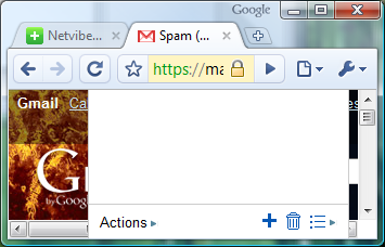
The other day I created a grocery list in Google’s Tasks as it appears inside Gmail.  I resized my browser window briefly and discovered what I thought was a Firefox 3.5 bug — The tasks pane rendering above the horizontal scrollbar:

Click to Embiggen
The Behavior as I First Spotted it, in Firefox 3.5 Mac

Before asking anyone about it, I decided to check if the same phenomenon occurs in other browsers. My research:

Not Just a Firefox Thing

I thought, maybe this is a Mac OS X issue. I booted into Windows and fired up IE8:

Definitely not Limited to Mac OS X

Then I wondered, would Google let this slip through in Chrome, too?

Sure Enough
Sure Enough

Finally I booted back into Mac OS X and loaded up Gmail in Opera:

Op ... Wah?
Op ... Wah?

I’m not sure what to conclude about all this. Is this a bug from which all major browsers suffer? I can hardly believe the functionality got into all these browsers accidentally. So is it a Gmail bug? It does get in the way of the horizontal scrollbar.  I guess the moral of the story is this:  When viewing Gmail with Tasks, don’t make your browser window too narrow.

Gmail Tasks and the Scrollbar

Firefox 3.5

Just downloaded Firefox 3.5 from Mozilla’s FTP site (yeah, you’re not really supposed to do that). It’s clear that JavaScript runs faster (which is a big deal to me), but I’ll give the latest browser a thumbs up just because of the New Tab button. For years the first thing I do when I install Firefox on a machine is add the New Tab button to the toolbar. Now it’s there in almost the exact same spot.

Firefox 3.5

Dear ESPN.com: Your Article Layout Sucks!

Hey, ESPN.com.

We’ve known each other a long time.  We started spending a lot of time together in college.  You’ve gone through several redesigns in that time.  Heck, I even blogged about some of them.  But lately, I’m not feeling it.

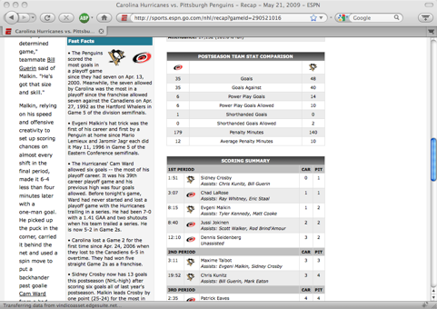
Here’s the thing.  Your article layout sucks.  Take a look at what I’m talking about:

Click to Embiggen
Click to Embiggen

See the smallest column, over there on the left?  That’s the text of the article.  The second column is a sidebar.  The third column is a statbox.  The fourth column, which is empty, runs the length of the page but is only occupied near the top, with an advertisement.

Note that on several lines, only two words fit in the first column, and on one line, only a single word fits.  And this is just one screen’s worth of one article.  It’s so painful that it makes the article unreadable.

Here’s my suggestion:  Change the article layout so that it has two columns of equal width.  The first column contains the body of the article, and is untouchable.  Nothing may encroach upon it.  The second column can contain anything else — advertisements, sidebars, statboxes, whatever.

A second option might be to take inspiration from the iPhone version of ESPN.com.  Let’s take a look:

ESPN.com for iPhone Screenshot

We’ve got an ad, the section header, the score header, then hey — what’s this?  It’s a pseudo-tabular nav header.  We could apply this to the main site!  Solve the layout problem by hiding elements (additional analysis, links, stats) until the reader wants to see them.  If we were to scroll down on the iPhone site, we’d see that for the entire length of the article, it occupies the full width of the browser window.  No element encroaches upon the article’s space.  In this respect, the article is easier to read on my phone than it is on my computer.  Not only that, but the layout of the article on my computer — at its narrowest point — is not as wide as the layout of the article on my iPhone.  That’s measured in characters or inches, take your pick.

So, ESPN.com, I still really like you, but you’ve got to work on this stuff.  Or what?  Or else, that’s what.

Dear ESPN.com: Your Article Layout Sucks!

Comcast Offers Upgraded Service to Customers, Anticipates Loss of NFL Network

Today I received an envelope in the mail from Comcast.  It was addressed to “Comcast Customer” and through the window in the envelope I could see the words “Important update re: your programming.”

I expected it to be a procedural letter of minimal importance, but I opened it anyway.  At the top of the letter there was some more text: “POSSIBLE NFL NETWORK CHANGES.”  If you haven’t read about it in the news, Comcast (abd I believe all of the cable companies) are in disagreement with the NFL over whether NFL Network is a premium channel or a basic channel, how much the NFL should charge the cable operators, and how much the operators should charge customers for the channel.

Also from the letter: “The NFL Network may stop providing its programming to Comcast on May 1, 2009.”

Because of this, the letter offers me Starz free for 12 months, or an Internet speed upgrade free for 12 months.  Starz isn’t bad, but it only offers one HD channel, so I went with the speed upgrade.

When the NFL Network started showing live NFL games, I added a package to my Comcast service so that I could see it.  I wonder if this offer has been extended to all Comcast customers, or only those who currently pay to have the NFL Network as part of their service.

Comcast Offers Upgraded Service to Customers, Anticipates Loss of NFL Network

Nuke the Fridge … to the Future?

If you haven’t seen Indiana Jones and the Kingdom of the Crystal Skull, you may not be familiar with the phrase “nuke the fridge.”  In the film, Indy finds himself on a nuclear test site in Nevada and climbs into a lead-lined refrigerator to survive the blast.  The phrase has been adopted by popular culture and has a meaning similar to “jump the shark.”

I recently read the Wikipedia article on Back to the Future.  From the section on the film’s development:

Originally, Marty was a video pirate, the time machine was a refrigerator, and he needed to use the power of an atomic explosion at the Nevada Test Site to return home.  Zemeckis was “concerned that kids would accidentally lock themselves in refrigerators”, and the original climax was deemed too expensive.

The footnotes seem to indicate that this information comes from Empire magazine, but I couldn’t find the article.

Steven Spielberg produced the three BTTF films.  He also directed the four Indiana Jones movies.  Did he pluck this (previously) impractical scene from an old project?  Who knows.

Nuke the Fridge … to the Future?