If you were to log into the dashboard of this blog and look through the drafts — posts that I haven’t published yet — you’d find one from January 31, 2013 — about nine months ago — titled “Buttons Should Look Like Buttons.” And if you looked at the body of that draft post, you’d see a big blank space.
Well, buttons should look like buttons.
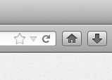
A great example of buttons failing to look like buttons — right next to buttons succeeding at looking like buttons — is Firefox. Let’s just focus on the reload button and the home button. When I am moving the mouse pointer on the screen, it’s very easy for me to tell where I have to click in order to trigger the home button. It looks like a button. It has clearly defined edges.
When I want to click the reload button, it’s very hard for me to tell where I have to click. I know the white area inside the black arrow/line/loop would almost certainly register. But what about the white space outside the arrow/line/loop? Can I click all the way out to the edge of the white area? Where is the border between the reload button and the button to the left of it (the menu dropdown)? Is there dead space between the reload button and the menu button? Do they butt up against each other?
It’s impossible to tell by looking.
Firefox is particularly infuriating because there are buttons with precisely defined edges immediately next to buttons with no button edges at all.
With iOS 7, Apple has done away with some clearly defined buttons. I believe that button borders are only gone in places where the button contained only text. In this respect, the button has been replaced — at least visually — by the equivalent of a hyperlink. And we’re all used to text hyperlinks.
I believe there’s one othe reason Apple can get away with that. Fingers are imprecise. And because we know that when we tap on a screen we don’t have single pixel precision, we know that there is compensation for imprecision. We are not anal about our precision, or lack thereof.
Looking ahead, I have seen screenshots of OS X Mavericks. It looks a lot like iOS 7. I am hoping Apple does not do away with button borders in the desktop OS, because when I use a mouse, I want clearly defined buttons.